Crash Bandicoot N. Sane Trilogy - Lighting and Textures
When the game was first revealed, the environmental lighting was very different, making a lot of places look washed out and less atmospheric, as well as too bright where things should be dark. Some textures were also considerably more basic, which was especially noticeable with crates and the first game's ruins, thanks to looking very clean and sporting dull colors. After listening to the fans' feedback, the developers gradually changed the look of these things to be more in line with the original games.
The screenshots below are just a few examples of how far the lighting and textures came during development.


N. Sanity Beach (First Look)
N. Sanity Beach was the first indicative of the game's initial problem with the new lighting technique. All of the ruins were gray and the environment looked washed out. Things in the distance were also slightly foggy. As you'll see in many other screenshots in this page, the crates used to look too bright. These are among the very first screenshots ever revealed, and their date indicates they're from a prototype that was done as late as December 2016.


N. Sanity Beach (PSX vs PAX)
(contributed by Robokai)Here are some comparisons between the prototype shown at the PSX (PlayStation Experience) event from December 2016 and the later build from PAX East, which was held during March 2017 . N. Sanity Beach became much more vibrant and closer to the original game after 3 months, and the fog in the distance was removed. These changes are identical to what is seen in the final version (though the crates still looked too bright here).


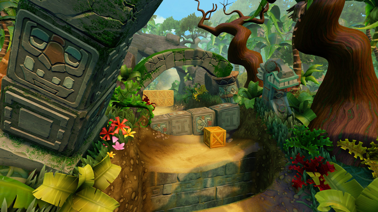
Tawna Bonus
The lighting seems mostly unchanged in the first game's Tawna bonus rounds, but the big tree where you start off was considerably different in early versions, particularly the big mushrooms growing out of it. You can also see how dull the crate textures looked at the time. It's worth noting that the crate icon in the HUD was too far from the counter, and the Wumpa fruit on the left was deformed, as was its counter. This is demonstrated in the left screenshot, with the right screenshot coming from the final version.


Upstream
The biggest difference in Upstream (besides what's already been covered in N. Sanity Beach) is how the water became less opaque. The first screenshot shows how it used to be during PSX 2016, and the second shows the PAX East 2017 version.


Sunset Vista (Bottom)
Sunset Vista was generally brighter due to the stronger sunlight. Perhaps more obvious is the much denser vegetation that used to grow around the ruins. The final version looks much closer to the original game (and likely makes platforming easier since there aren't so many plants obscuring the ground). The screenshots here alternate between the prototype and final versions for comparison.


Sunset Vista (Top)
The background in Sunset Vista used to be more orange and less red, and it was generally foggier. Most importantly, a generic mountain was in Cortex Island's place. The ruins also had more basic textures and the lighting was dramatically different. This can be seen in the dynamic PS4 theme that came with pre-orders (left screenshot).


Jaws of Darkness
Though only visible for a couple of seconds, Jaws of Darkness was revealed in the very first trailer, and it looked quite unfinished at the time. The lighting is extremely basic, as are the textures on the ruins. The snake enemy is also missing its textures entirely. The right screenshot shows the final version, with dirtier-looking ruins (and larger gaps between certain stone blocks) like in the original game, as well as the snake enemy looking as intended. The lighting is also noticeably improved.


Road to Ruin
Road to Ruin used to look much brighter, and you could even see things in the background in detail, rather than the more atmospheric silhouettes the level is known for. Not only that, but it had a ton of foliage growing out of the ruins, not unlike Sunset Vista. The frilled-neck lizard up ahead looked quite different and had a more muted color scheme. Lastly, the camera angle was slightly lower. This was all changed in the final version (right screenshot), which looks much closer to the original Crash 2.


Makin' Waves
A bit of context before we start: the first screenshot is from an early June 2017 video released by someone who had temporary access to a prototype build. This person wasn't supposed to show this level and the video was quickly removed as a result. The white square on the top-right corner is just there to conceal the original uploader's identity (who provided commentary for the video via an overlaid recording).
Getting back to the screenshot at hand, it shows the level Makin' Waves with a very different look. Harsher lighting and old crate textures aside, the sky was completely changed for the final version (second screenshot), which ditched the foggy weather with spiral clouds (which aren't seen anywhere in the game) for something more classic and in tune with the original PlayStation title. The skull rock in the distance was also made much clearer.


Hog Ride
As the white square on the top-right corner suggests, these screenshots come from the same footage as the prototype Makin' Waves. You can see why the developers were strict on which levels to show: Hog Ride alone had a ton of placeholder textures, which you can see on the billboards and boost pads. They were intentionally basic and color-coded so the developers wouldn't forget to replace them (a common technique in game development).
